Monday, October 8, 2012

Limitations of on screen graphic representation

Limitations

When creating a TV ident there are a lot of limitations that need to be thought about in the process of making, everything has to fit in with the pixels and resolution of different TV's, also the picture has to fit within the ration of different TV's like 16:9 or 4:3.

Every TV screen is make up of tiny squares which are green, blue and red, depending on what TV you have they quality of these squares will be different. With a 1080p screen there are more pixels so there will be a higher quality picture for TV idents, they don't need to worry too much about this screen because most idents will flow smoothly on it. They need to think about 720p or 480p because there are less pixels the picture isn't as sharp. So when creating an ident they need to take in to consideration the pixel size of TV screens because if they made a very curvy ident then on TV's with less pixels it would have a staircase effect because the pixels can only be one colour per square at a time.
 
These are what TV screens are made up of.


This BBC Three ident is from a 720p TV screen if seen close up the pixels can clearly be seen, this is one reason that idents rarely use to much curved text in their idents.


These are the different TV sizes, they higher number there is the more pixels the screen has.
TV ration refers to the screens width by height. Traditional TV ration is 4:3. A 32-inch traditional screen would be 25 1/2 inches wide by 19 inches tall. Most televisions now use the widescreen ration which is 16:9. A 32-inch widescreen TV screen would be 28 inches wide by 19 inches tall.


When creating an ident the ration of the TV's need to be considered, there are two different ratios for TV's which are; 16:9 and 4:3 so if there is text in the ident then it need to be within 3% of the border over wise people with different sized TV's wouldn't be able to see all of what is on screen.


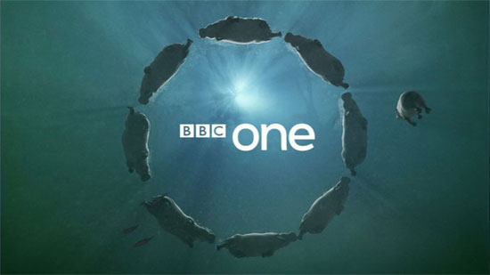
Some idents can't use certain colours because other channels have used that colour for their ident and it is a statement colour for that channel, also the colours they use have to reflect the audience and shows they have on, for example; BBC One can't use purple for their idents because E4 has it as their signature colour, also the colour wouldn't fit in with the channel because it is a colour more related with a fun atmosphere and the BBC One logo is more serious and factual.
Also very bright or fluorescent colours wouldn't work on idents because they would be harder fro people to see and if people have bad eye sight it could mess with their eyes and cause people problems.  

Sunday, October 7, 2012

Opportunities of on screen graphic representation

Opportunities

A brand identity of a company is essential for the creation of a TV ident.
If a channel is aimed at younger people then that channel must have idents that attract the attention of younger people and it has to relate to them with; colours, text, layout and design. For a channel which is targeted at young people there needs to be enough relevance to the programmes shown, this can be shown in many different ways, sometimes they have characters from their TV shows in the idents so people can see they type of shows that are on these channels.

This ident has Perry the Platypus from 'Phineas and Ferd' which is a TV program on the Disney channel, including a character from a TV show represents the channel more and it shows the viewer exactly what they would see on this channel or it could show that this is going to be the next programme on.

A brand identity is used as a general guideline for an ident so that the ident is relevant to the channel, its shows and to the target audience. If there were no guidelines then the ident could be about anything and have no relevance to the TV channel and it wouldn't reflect any of the programmes that are on.

Lambie Nairn is a company that create idents for different companies and TV channels, they work very closely with the TV channels to create the right type of ident for them. They look at ever aspect of the TV channel to really capture what that channel is about, who it is aimed at and to make sure the ident represents the channel in the right way.
"At Lambie Nairn we understand that every client, every project and every deliverable is unique. We always tailor the work we do, starting by really understanding the needs and requirements. Whilst this may sound familiar, we believe that it's not just what you say you do or how you say you do it, it's the way you actually do it that makes the difference"  - Lambie Nairn website.


Lambie Nairn created the 'Blob' idents for BBCThree, this channel is aimed at teenagers and young adults. After seeing what type of programmes BBC Three broadcast they went away and designed the blob characters with a bug 'BBC THREE' in the background. These blobs do random things like sing and dance, they take the seriousness out of everything showing that it is for a younger audience, it creates a very humorous and cheerful tone for the channel.

Thursday, October 4, 2012

Design of a TV Ident

Ident Designs

When creating and designing idents there are a lot of different things that need to be considered in the process. Everything needs to be taken in to consideration when designing a tv ident. 

Firstly the density of information, viewers don't want to sit there and read a whole paragraph, they want something with just the key word or phrases and as little text as possible. If a lot of text is needed then have someone doing a voice over of what it says. 

Then space and time, there are different sized TV screens so not all idents will fit perfectly on all TV's also the timings need to work with any voice over or anything else going on.
On all idents there needs to be a 3% gap around the edge with nothing in it so that nothing gets cut off by certain TV's.  


This gap is because some TV's are made at the ratio 16:9, these are widescreen TV's, and others are made with a ratio of 4:3 which means the screen is smaller. 
All idents need to be big and bold so that people will remember it and so that people can clearly see what it says, and text on the screen should be in the centre of the ident because then it will be clearly identified and seen clearer. 


BBC have rebranded since their very first idents, their ident used to be the letters 'TWO' Alan Yentob said 'I realized that the TWO identity was a problem as soon as I took over the channel. It was obvious that the logo made absolutely no impact' This shows that the brand identity had to be changed to something that would have an impact. This is when the number 2 idents came in.

This is BBC 2's Cappuccino ident, it has quite a simple design in the way that it is set up. The tempo and pace of this ident is quite fast but gives enough time for the narrator to do a voice over for the next programme. This ident is shot from a high angle and is zoomed out during the ident. It starts close up of just the stencil and foam in the coffee cup, then it is zoomed out to a wide shot then the whole coffee cup can been seen.
This ident symbolises a relaxing and chilled out program, also it could symbolise a program coming up which is aimed more for adults because they are normally the ones who drink coffee. It also could be a program more intellectual, something adults would be more into. It could mean that the next program is quite relaxed and something that should be in everyday life because the idents features coffee which is normally something you sit down and chillax with, it would still be more appealing to adults because the colours are quite minimal and plain. 

All channel idents aim to keep their target audience interested by creating idents that would relate to them.
So more informational channels would have intellectual idents with minimal and pastel colours, channels such as BBC4 which are very informational based.
This ident for BBC4 is of books in a library, this shows that it is a very educational and informational channel and that is the type of programs you would expect to see on this channel. 


This ident for the channel Dave shows that it is mainly for entertainment, this can clearly be seen in everything going on in the ad, its all a bit crazy and random. It also has bright colours which is more appealing to teenagers and young adults. This ident represents the type of programs this channel shows more entertainment based shows rather than informational shows.  

Wednesday, October 3, 2012

Purpose of a TV Ident

Why have an Ident?

Idents are used for all different things and they have many different purposes.

It can be used so that people know what channel they are watching, also it gives some time for the narrator to take about the next programs on. The idents sometimes reflect the nature of the next program so people know what it is likely to be about. Some idents are made to show what the next program could be about so that people can decide if they want to watch that show or now.


This ident for E4 could mean there is something maybe not suitable for younger children or something which could include violence. Its almost like a pre-warning as to what the program could have in it or what it could loosely be in reference to.

It promotes the channel, the ident represents the type of programs the channel shows and who it is aimed at. e.g- Bright colours, on the BBC Three ident, would appeal more to younger people therefore it represents programs for teens and young adults.


The music in this ident sounds quite modern, even the words used by the narrator can relate to younger people.

Idents are also used to break up program scheduling so that there is some kind of gap in between programs. These idents have to be quite flexible with their timing because if the narrator has a lot to say then the ident needs to last as long as the voice over otherwise it would just be a black screen and people would get bored.


Some idents represent the history or a story behind the channel, channel four's logo of all the pieces of 4 coming together represent a different range of programs coming together. The Channel 4 puzzle logo, make up of 9 blocks, was the first ident that a TV company used an on-air identity to reveal itself as a brand. The logo became an icon. The blocks are still used in the channel 4 ident today.
"Channel 4 didn't make programs. It just commissioned them. So the identity expressed the idea of different elements coming together" - Martin Lambie-Nairn.